
For some time now, it has been possible to make tooltips in Power BI even more attractive and informative. Using tooltip pages, you can, for example, display charts or other visuals in tooltips.
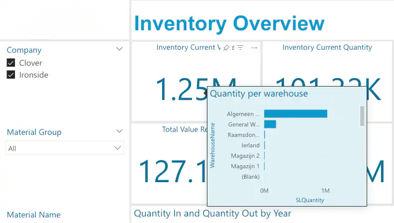
Creating a Tooltip Page
To create a tooltip that includes, for example, a chart, create a tooltip page. A tooltip page is simply a new page on your dashboard of the “Tooltip” type. You can select the type in the page’s canvas settings.
You can add all sorts of things to a tooltip page. It’s actually just like a regular page. You can add any visual you want. A tooltip page can be set to “hidden” in the dashboard, so it won’t be visible to the end user as a page within the dashboard itself.
Link a tooltip to a visual
A tooltip can be linked to an existing visual in several ways. First, “Tooltips” must be enabled for the visual. Then, you can select a specific tooltip page or set the tooltip to “Auto.”.
If a visual’s tooltip is set to “Auto,” the tooltip page associated with the fields in the visual is displayed. This is because “Tooltip fields” can be specified on a tooltip page. The tooltip will then be displayed for all visuals that use those fields. If multiple tooltips have been created for certain fields, the most appropriate one will be selected. For example, if a tooltip and a visual have two matching fields, that tooltip will be displayed before one with only one matching field. If the tooltips have the same fields, the first one will be displayed.
The “Keep all filters” checkbox ensures that the filters applied to the visual are also applied to the tooltip. This works especially well when, for example, you hover over a specific section of a bar chart. The tooltip is then neatly filtered based on that selection.
Modern visual tooltips with drill-down functionality
In addition to creating personalized tooltips, it is also possible to create modern visual tooltips. The main improvement over the old tooltips is that the tooltip adapts to the dashboard’s theme and allows you to trigger a drill-down directly from the tooltip. At the time of writing, this option still needs to be enabled because it is currently a preview feature. This can also be enabled in the Power BI Service under the dashboard settings.
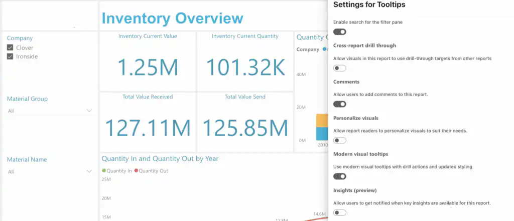
If the feature is enabled and the visual’s tooltip type is set to “Default,” the tooltip will be updated automatically. It does appear that the “Drill down” option only appears if a “Drill through” is also linked to the visual, but that may be updated later.
Conclusion
Adding custom tooltips makes the dashboards even more appealing and interactive for the end user. It also allows you to display just a little more information on a page or in a visual. The default tooltips were really nothing more than data labels.