The strength of Power BI lies in its clearly visualize your business data. This way, you can see at a glance how your numbers are shaping up, what progress has been made, and where adjustments are needed.
But how do you choose the best way to display employee data, for example? And how do you make it clear to team members that sales are trending downward? What kind of chart should you use for this? Which colors work well together? And how do you keep visuals and dashboards clear and easy to interpret?

Here are a few basic tips to get you started (source: https://learn.microsoft.com/en-us/training/paths/power-bi-effective/) to create attractive and effective visualizations in Power BI.
Determine the goal and the target audience
Before you start creating visualizations, make sure the purpose of your visualization is clear. Who is my audience, and what questions do they have? What do I want to convey with my report or dashboard?
This allows you to select the metrics and dimensions you need, which helps guide your choice of a specific visualization. Also, try to imagine what the user wants to see.
Keep it simple
Power BI offers a wide variety of tools for visualizing data. However, try to exercise restraint and don’t use too many visuals in your reports and dashboards. The purpose of your visualization is to make the underlying data easier to understand, so you can make smart decisions.
A simple graphical visualization is sufficient for displaying certain data, while other data requires a more complex visualization. Be sure to use titles, labels, and other adjustments to help the reader.
Take a shortcut with the BI Power Pack! Powerful report sets at a fixed price!
Choose the right colors
Contrast
Insufficient contrast makes it difficult to understand and interpret data.


Color Palettes
the wrong one color palette can cause contrast issues, making it difficult to distinguish data.
Highlights
Using color to highlight key dates helps you convey a message effectively.


color blindness
About 8% of men and 0.5% of women are colorblind. Do not use red and green together, or use a Power BI theme designed for people with color blindness.
Meaning
Use color to distinguish or highlight groups of data. This draws attention to them and helps you get your message across more effectively.

Appropriate color scales
Use non-standard color palettes only if there is a midpoint that needs to be compared with other data. Sequential data works better with a color scale ranging from light to dark.
Identifying Key Elements Color is a powerful tool for drawing attention to key elements of a report.


Distinguishing Between Colors and Data
Use a greater contrast between data points that are close together or overlap. This is the best way to display the information efficiently.
Use the best type of chart
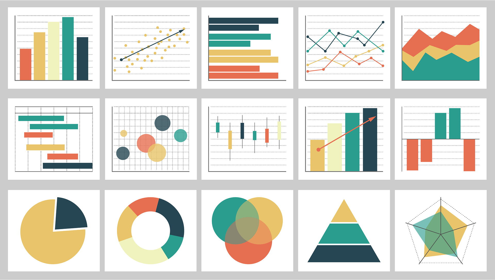
The purpose of charts in your report is to convey conclusions and insights visually. Depending on what you want to show (a distribution, a comparison, or a trend), there is a chart or diagram that best visualizes it.
Bar Chart
You use a bar chart to show certain compare values or to a distribution to visualize. For example, the sales of various products.

Line Chart
You use a line chart to visualize how something changes over time or to show trends.


Scatter Plot
Diagrams like these are useful for illustrating relationships between different data sets.

Bell Chart
This chart resembles a scatter plot, but the size of the bubbles adds an extra dimension, allowing you to incorporate a third value into your visualization.
Pie Chart
Suitable for illustrating a distribution. However, do not use a pie chart for data involving very small differences; instead, use it to show a general distribution.

These practical tips will make your visualizations in Power BI easier to interpret. Would you like some additional tips, or do you not have the time or inclination to design your own reports and dashboards? Then be sure to check out our Data & BI Solutions, which lets you get started with data analysis in no time.