
A good dashboard or report has at least the following two characteristics: the data reflects reality, and the user can effectively use it to meet their information needs. The latter of these two characteristics is often overlooked: the numbers displayed may be accurate, but the message doesn’t come across. A major pitfall is including as many tables and charts as possible out of fear that information might otherwise be missing. In this blog post, I’ll walk you through a step-by-step plan to help you avoid this—and other—pitfalls. I’ll apply these tips directly to a report that’s factually accurate but could still be improved in terms of effective design.
This is a page from a report on user statistics for a Power BI environment:
This report is full of information, the elements aren’t neatly aligned, the margins around the elements aren’t uniform, and there’s little structure to it. It’s a good starting point for a report, where a few simple steps can go a long way toward improving the report’s effectiveness.
Step 1: Preparation
Before you start building your dashboard, it's important to have a clear goal in mind.
Creating a dashboard is just like using your GPS: you have to specify a destination first before it can plan a route. The more accurately you enter where you want to go, the better it can recommend a route that takes you to your desired location. Imagine you want to drive to the Ensior headquarters. If you only enter the town ‘Driebergen-Rijsenburg’ into the navigation system, you’ll get fairly close to your destination, but only when you also enter the street name and number will you actually arrive at the exact spot you want to be.
Clearly defining your goal is therefore crucial, just as it is when building a dashboard. At first, this will be very basic—for example, ‘a sales dashboard’ or ‘an HR dashboard.’ The trick lies in specifying the goal in concrete terms. After all, the end user might want a sales dashboard for management to compare different sales representatives. Or, conversely, a sales dashboard for the sales representatives themselves to track their own sales against their targets. Such details are important.
A well-defined goal answers the following questions: What is it? Who is it for? What is the need?
Once you have a clear understanding of this, you can begin to define the information that needs to be presented to achieve the goal. I recommend doing this the traditional way, using ‘User Stories.’ A User Story includes a ‘who,’ a ‘what,’ and a ‘why.’ It takes the form If {who}, I want {what} because {why}. For example: “As CEO, I want to know if there’s an upward trend in our revenue over the years because I want to have a better grasp of my company’s growth.” Without these user stories, you run the risk of overlooking important insights while also presenting unnecessary ones, which can make the information overwhelming.
Step 2: A Theme
Having a good theme can save you a lot of time, especially if you’re going to create multiple reports. You won’t have to set up a large portion of the formatting for each visual individually. This saves time while creating the report and improves consistency. Those who are already experienced with Power BI themes probably know that you can customize more aspects of a theme than what’s available in the theme editor by editing the JSON file, but that’s a bit too advanced for now. If you’re interested in doing this, you can find more information online.
The starting point for your theme is your corporate identity. Using your corporate identity not only looks more professional, but it also has a positive effect on how the report is used: taking the step to use Power BI can be a big and daunting one, but using your familiar corporate identity can make that step seem a little less daunting.
All roads lead to Rome, but the way I work is by using the ‘Color Picker’ in ‘Microsoft PowerToys’ which allows me to retrieve the hex code of a selected pixel on my screen. I then enter this into the ‘Power BI Theme Generator’ by ‘PowerBI.tips’. I usually select ‘Gradient’ under ‘Palette.’ If you use the free version, you can’t export the JSON, so you’ll have to copy everything manually into the theme editor in Power BI. You can find this theme editor in Power BI Desktop under View -> the dropdown menu under Themes -> Customize current theme.
When using your corporate identity, be mindful of the meanings associated with colors. If we were to use Ensior’s corporate identity, we’d quickly notice red and blue. If we were to use these colors in charts, the red elements would quickly take on a negative connotation. In such cases, focus more on shades of blue and gray, and use red only in places where that negative connotation is intentional—and, at most, in a few details.
Also try to avoid black and white, especially for text and background colors. Too much contrast makes reading text with these colors less comfortable. For example, use very dark gray instead of black and very light gray instead of white. This reduces the contrast slightly, which is easier on the eyes.
Step 3: The Layout
A well-known quote in the real estate world is “Location, location, location!” There's only so much space available, and some locations are more in demand than others. This also applies to dashboard design. You need to think carefully about which visuals really add value, and where on your canvas you'll place them.
You don’t need to know the exact details just yet, but figure out roughly how many KPI/Card visuals and how many other visuals you’ll need. For example, two KPIs on annual sales totals, two KPIs on the number of customers, one visual showing sales throughout the year, and one visual showing sales by product. Also try to determine which ones are more important than others. It helps to already know what level of detail you need—don’t go beyond that. Maybe you don’t need to show sales compared to last year in a line chart at all; a KPI might be enough. If you do end up using the line chart (which takes up more space than the KPI visualization), you’re not making the best use of the space you have.
In Western cultures, we’re used to reading from left to right and from top to bottom. This means we also read a dashboard in a sort of ‘F’ shape. Start at the top and read from left to right, then move to the middle row and read it from left to right, and finally read whatever is at the bottom. In the previous step, you already considered which visuals are more important than others; these should therefore be placed higher up on the left. Also, try to place items that are related to one another close together.
A helpful tip is to plan it out in PowerPoint. There, you can place shapes and charts for the visuals and easily align them with each other. Also, make sure that the margins between elements are consistent throughout.
Step 4: Formatting Visuals
Now that you have a good layout, you can start creating visuals. You’ll need to think carefully about which visuals to use, since each type of visual has a specific use case.
There are certain rules of thumb for choosing your visuals. For example, if it’s about time, it’s probably a line graph. If it’s about different categories, it’s probably a bar or column chart. If it’s about a location, it could be a map. Here’s one from earlier: blog rewritten. Try to save a large table or matrix for a detail page.
Make sure all information needs are met, but keep it as simple as possible. Every chart should be easy for everyone to read. Give it a clear title and, if necessary, a subtitle, clear axes, axis labels, a legend, etc. Make sure the most important element stands out the most. For example, in a line chart showing sales for the current year and the previous year, this year’s line could be in a theme color, while last year’s sales could be shown in gray.
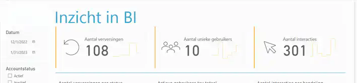
Using icons can also be very helpful for quickly understanding a visual and seeing at a glance what you're looking at. See the example below—the top border from our new BI User Statistics report:
Here are a few other practical tips at a glance:
- Use conditional formatting when necessary, but be sure to keep your target audience in mind. If there are people with color blindness, it’s a good idea to use another indicator in addition to color, such as an up or down arrow.
- Ensure consistency among visuals. For example, in a sales dashboard, set the colors so that employees see the same colors across different charts.
- Make sure items are sorted logically! For example, don't list the months of the year alphabetically, but in the order they appear in the year.
- By adding a border to the elements on your canvas—with a radius of, say, 3 pixels and a light color—you can improve readability.
- By creating more white space through. padding With a spacing of, say, 10 pixels, the elements look more balanced.
- Always round numbers to as few decimal places as possible, and use the formatting options for thousands (K), millions (M), etc.
- Would you like to provide more information or clarification, but don't have enough space? Use tooltips.
Step 5: Wrapping Up
Once you’ve created a great dashboard, you’ll need to have it tested. It’s possible that something you thought was attractive or useful doesn’t quite come across that way to the end user. Or that you haven’t quite met all their information needs. This is just part of the process, so ask for feedback! You can do this earlier in the process, but it’s definitely something you shouldn’t skip at the end. The most valuable report is the one that’s actually used by a satisfied colleague!
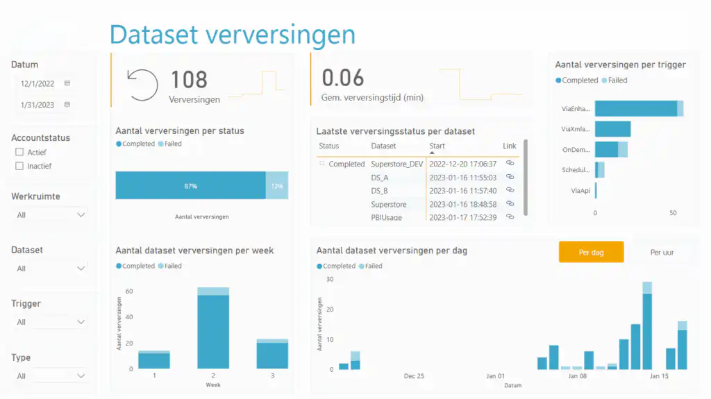
With these tips, the user statistics report has already changed significantly. Take a look at what one of the pages looks like now:
Conclusion
With these tips, the report has already improved significantly. You’ll notice, for example, that it now has a soothing color scheme. The background of the elements is light gray with a 3-pixel rounded border, and each element has 10 pixels of padding. KPIs display important information, with an icon that appears on the main page. You can switch between two similar charts using the ‘Per Day’ and ‘Per Hour’ buttons. These changes are based on the tips mentioned above.
Good luck and have fun creating beautiful dashboards!